
Written By
Jennifer Seay
CEO & Founder, Art + Artisans
For years, I’ve sat on one side of the table at Art + Artisans. My team and I work every day as art consultants for commercial real estate developers, corporate clients, educational institutions, and the brilliant architects and designers who bring their spaces to life. We are advocates for the visual soul of a property. We preach the gospel of early planning, realistic budgeting, and the undeniable ROI of real art by real artists.
Then I became a co-developer myself, and everything I’d been telling clients for years got put to the test on my own project.
The Project I Couldn’t Say No To
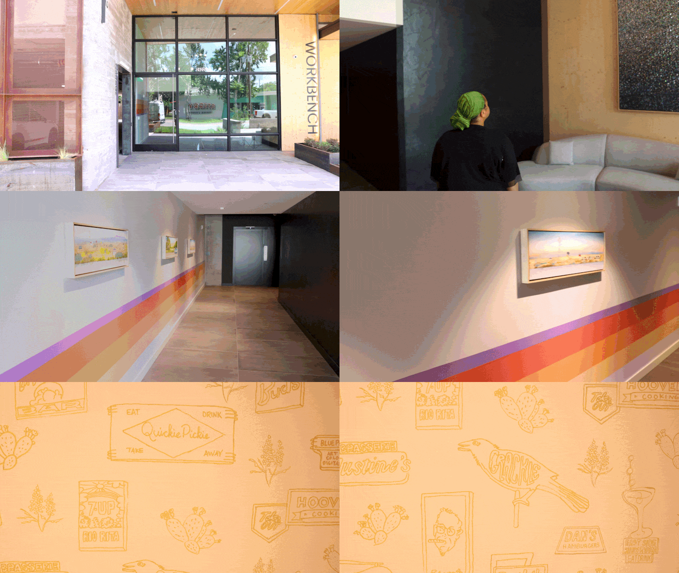
A walking tour of the first floor of WORKBENCH in East Austin.
It started at a happy hour. My friend DeLea Becker, Founder of Beck-Reit Commercial Real Estate, was involved in a new project called WORKBENCH, a mass timber building being co-developed by a group of local companies from across the commercial real estate sector. I went to support her. I left knowing I wanted in.
It wasn’t just the building design, though it was beautiful. I loved the synergy between all these different companies. They wanted to build something meaningful together, and I knew that Art + Artisans belonged in that mix. As I met the other partners, that feeling only grew. I could see WORKBENCH becoming a home for my company that reflected who we are, and a community I’d be proud to bring my team into.
What I didn’t fully anticipate was the impact the project would have on the way I think about my own work.
With WORKBENCH, I found myself occupying two unique roles simultaneously for the first time. I was a property developer purchasing artwork for the building’s common areas, and a corporate client selecting art for our own new office space inside the building.
Stepping into my clients’ shoes was an eye-opening, humbling experience. Here is what I re-learned, what surprised me, and how it changed my perspective forever.
Why the Timing Matters as Much as the Numbers
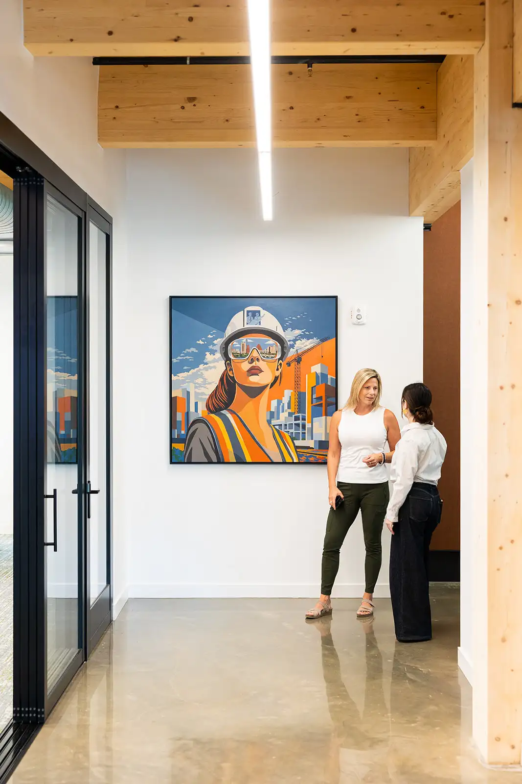
A painting honors women in construction at Swinerton’s offices on the second floor of WORKBENCH.
I always tell clients to start thinking about art at the earliest stages of architectural planning. Because when art is part of the story from day one, it gets to actually tell that story. It’s integrated with the design instead of retrofitted. It’s also so much easier to build an honest number into a budget you’re already assembling than to go looking for that money later, once every other line item has claimed its share.
But I came aboard the WORKBENCH project after the early planning was done. The art budget had already been set, and it wasn’t in line with market realities. Everyone loves the idea of art, but there’s little understanding of what it costs to fairly compensate real artists.
Fighting for My Own Art Budget
Given the circumstances, I did what I always tell my clients to do. I made the case. I sat down with my partners and explained why the number on the page wouldn’t do the building justice.
To give you a sense of just how off the original budget was, we ended up spending roughly 5.5 times, or about 450% more than what was originally allocated.
There’s a real irony in having to fight for the art budget on your own building. But now that I’ve done it, I can say the same thing holds true whether you’re an art consultant or a developer. The number that feels big at budgeting time is small next to the returns you get from the art.
Give art its own line item. Don’t fold it into FF&E. Art is genuinely inexpensive compared to almost any architectural finish, and it lasts far longer. Few people will notice the difference between mid-grade and high-grade tile. Everybody notices the art.
Buying Art for My Own Office
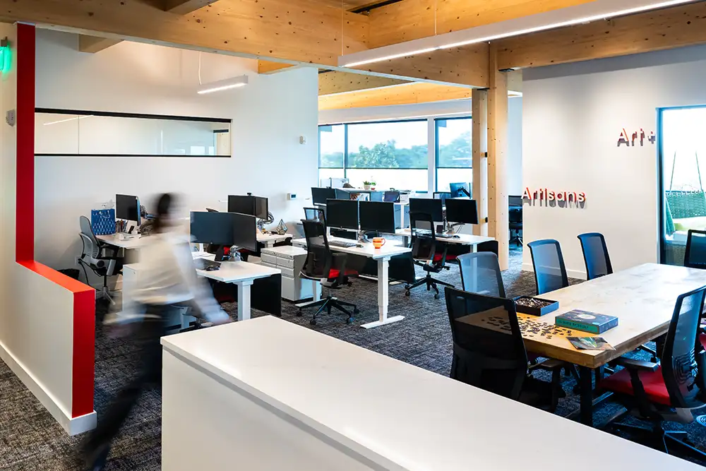
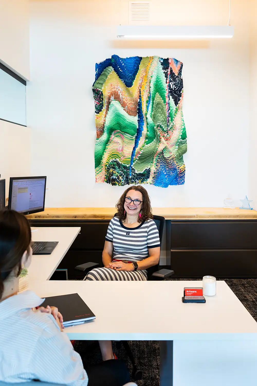
The new Art + Artisans offices at WORKBENCH. Come by for a tour!
In the middle of all this, I also had to pick art for Art + Artisans’ new office inside WORKBENCH. That put me in the role of client, staring at a quote, thinking, Do I really want to spend this much? There are a hundred other things I could put this money toward.
In a new way, I understood exactly what my clients feel. It was a useful discomfort that gave me profound empathy.
What got me through it was doing the math I always advise my clients to do. I’m going to be in this office for five to ten years. What does that actually cost me year over year? The numbers shrunk fast, and it’s nothing compared with how my team and I feel when we walk in every day and see art that inspires us.
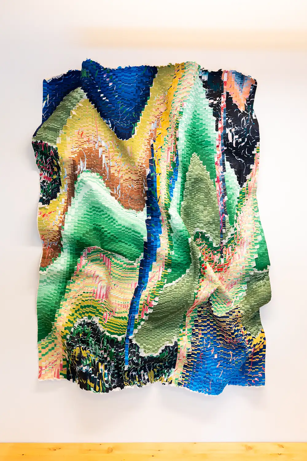
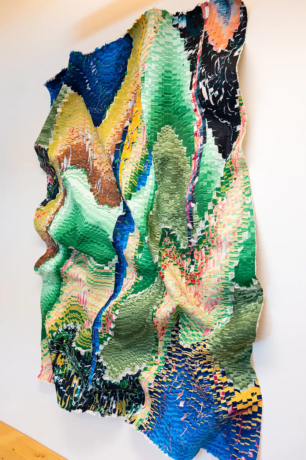
I wanted to feel energized by the art in my office. I love color and dimension, so I chose a bold textile piece by artist Kenny Nguyen that’s full of dimension and color and really speaks to my personality.
My office is designed so you can see inside without entering, and the piece just exudes energy to anyone who walks by. I think good art can do that for any company looking to communicate something about who they are.
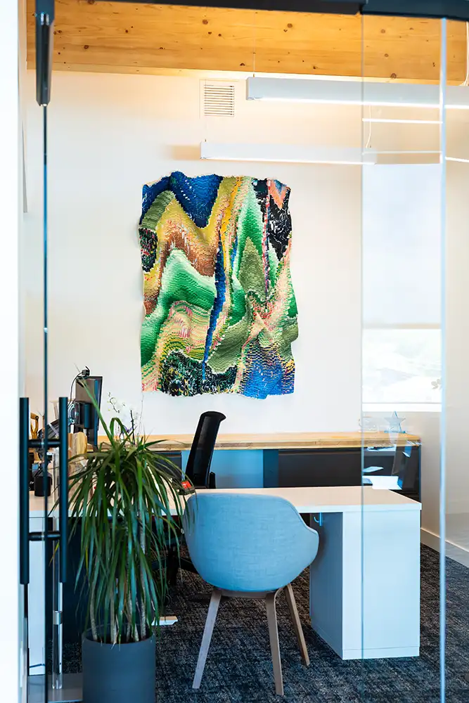
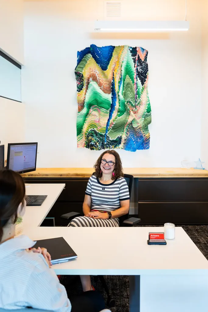
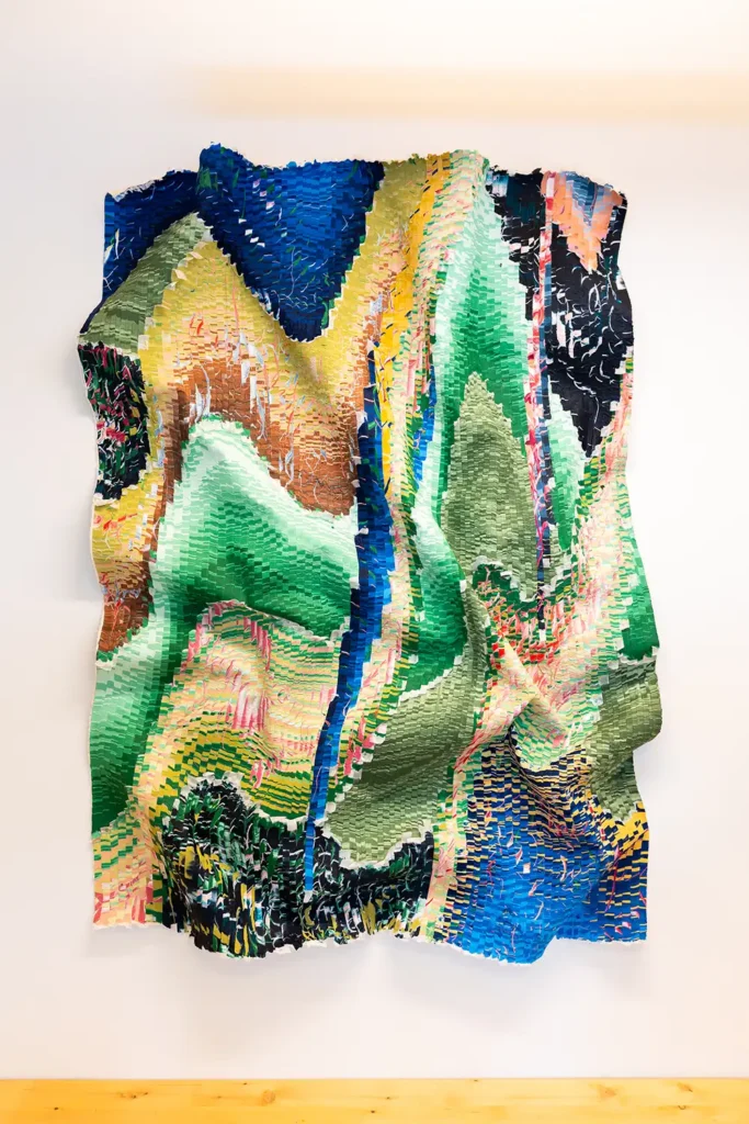
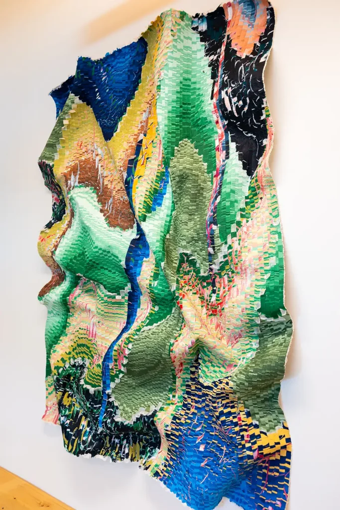
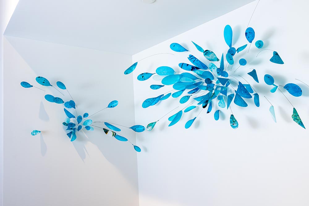
Gallery: For my own office, I selected art with a lot of color and dimension because I want the art to energize me when I see it every day.
The WORKBENCH Art Collection and What it’s Doing for the Building
For the common areas of the building, we formed an art selection committee of all the partners, reviewing color palettes and narrowing down choices together. Because sustainability and community were core pillars of our mass-timber project, we used the art program to anchor those values, choosing incredible local artists throughout the project to establish a true connection to the community.
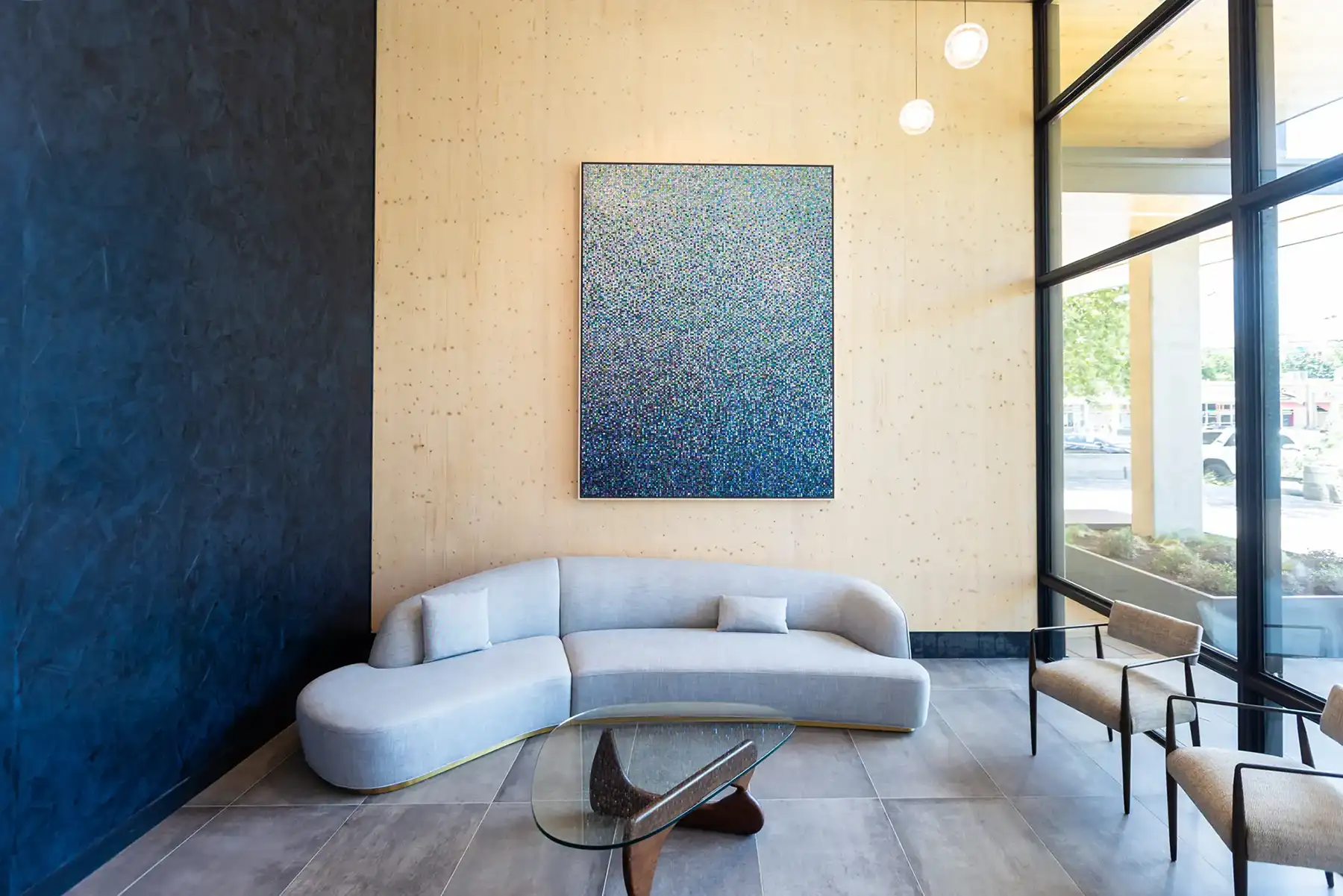
Sustainability mattered to us, too. Our main lobby feature is a striking, 6’ x 8’ sustainable original artwork made of 26,980 recycled, hand-punched aluminum discs. Each disc is individually nailed to the wood frame. They move with any air current, fluttering and shimmering. The movement is both surprising and engaging. I love seeing it catch people off guard and draw them in to take a closer look. This is the first thing you see when you step inside. It immediately sets a creative, elevated tone.
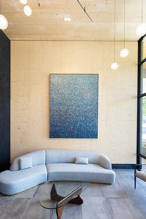

Left: Hannah and Nemo’s Aurora, a 6′ x 8′ artwork made with thousands of hand-punched, recycled aluminum discs sits in the first-floor lobby, a monument to the sustainable intent behind the mass-timber building. Local artists were chosen for all the art to establish a connection to the community. Right: Each aluminum disc is nailed to the wood frame so that a flurry of motion shimmers across the piece with any current of air.
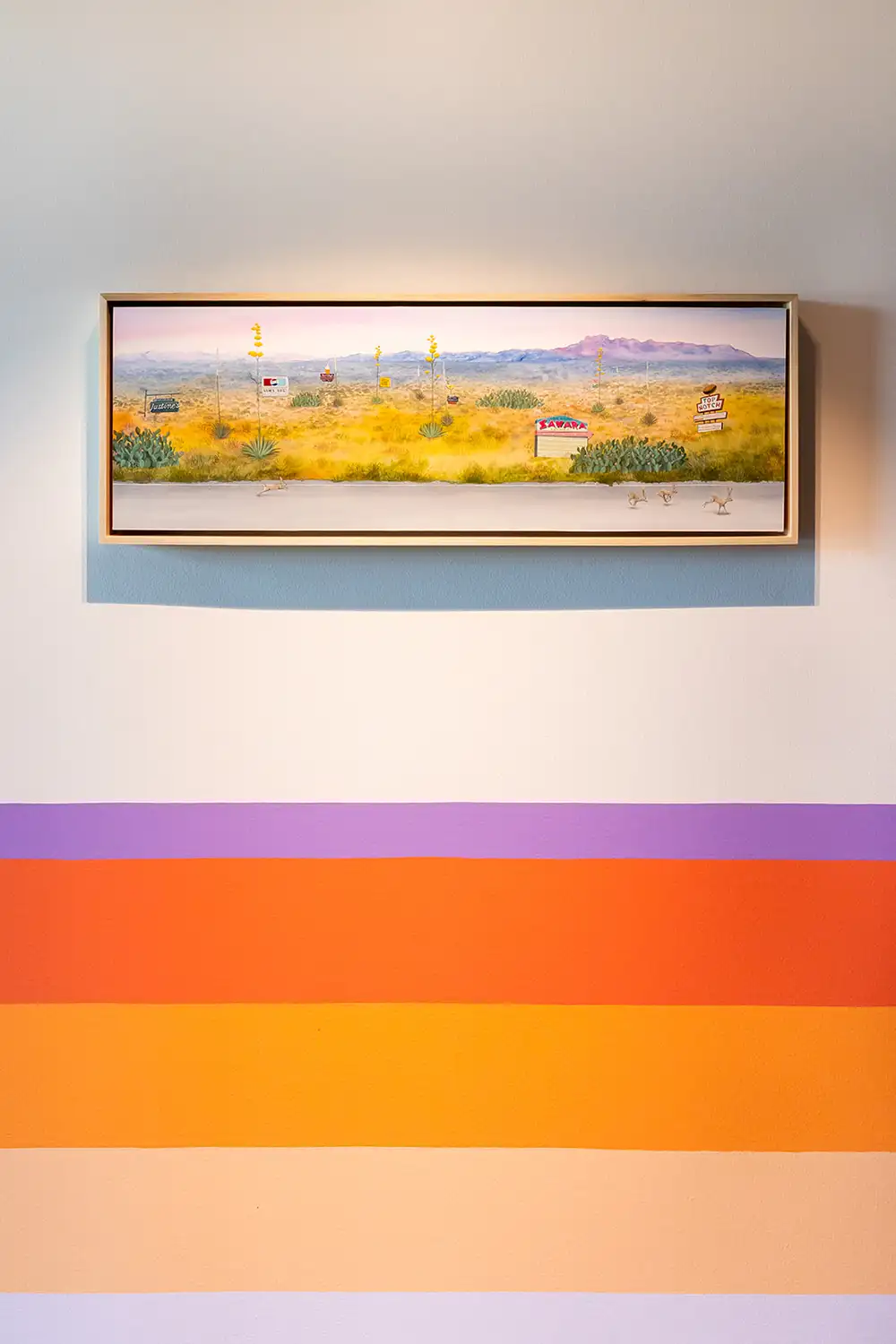
Down the hallway from the lobby, a lively, panoramic series of paintings follows a pickup truck driving through the Texas Hill Country from day to sunset, with local flora and fauna and small business signs tucked throughout.
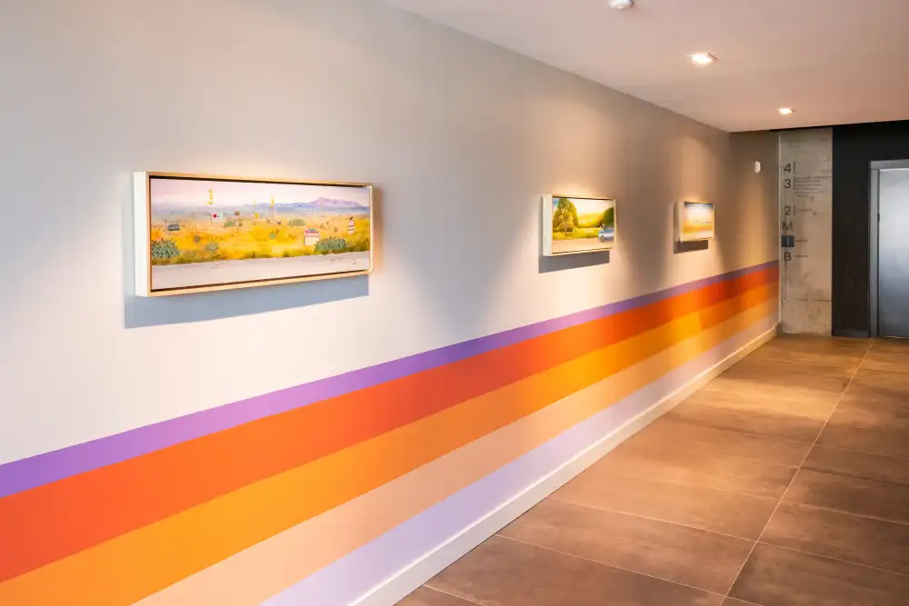
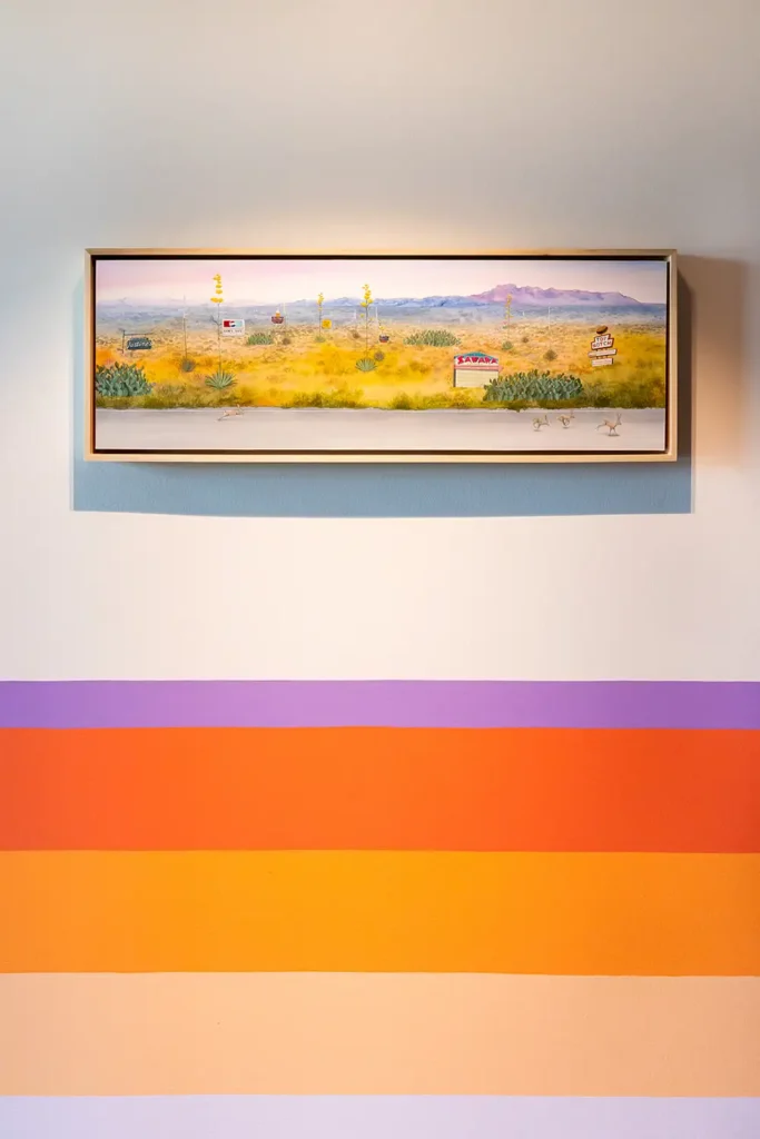
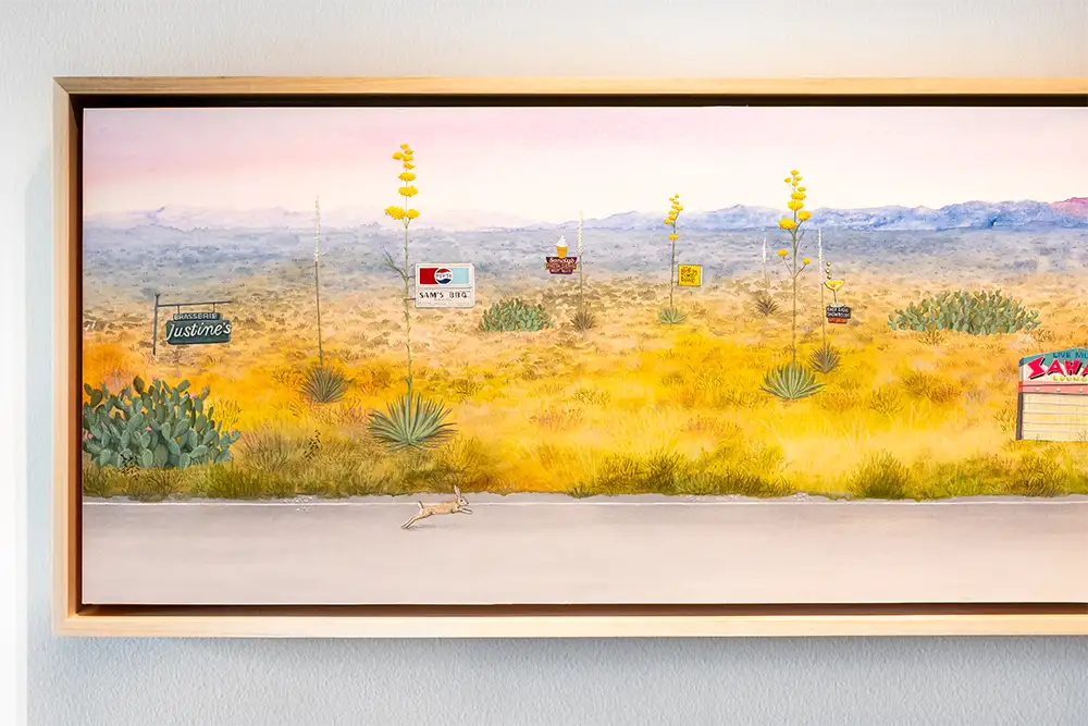
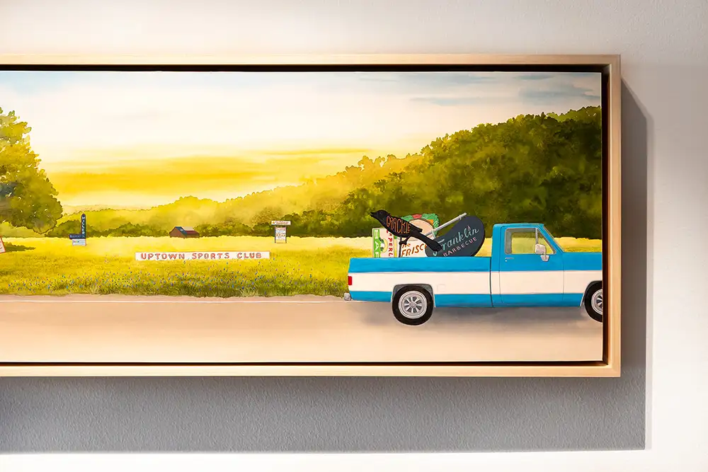
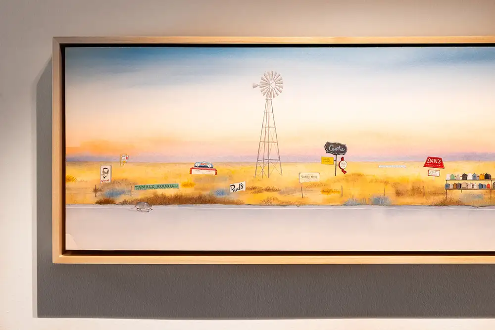
Gallery: A whimsical triptych by local artist Heather Sundquist Hall features a pickup truck driving through a hill country landscape. Click the images to zoom in and see how many local Austin Easter eggs you can spot in the paintings.
Next to the elevator, a hand-drawn mural styled to look like wallpaper continues with the theme of local business signage and native plants. One WORKBENCH partner tenant, a fourth-generation Austinite, knows many of the owners of the businesses represented in the mural and took pictures of it to send them because she was so excited.

A hand-drawn mural that looks like wallpaper, by local husband-and-wife team Michael Wayne Hall and Heather Sundquist Hall, sits next to the first-floor elevator and continues the local business signage theme.
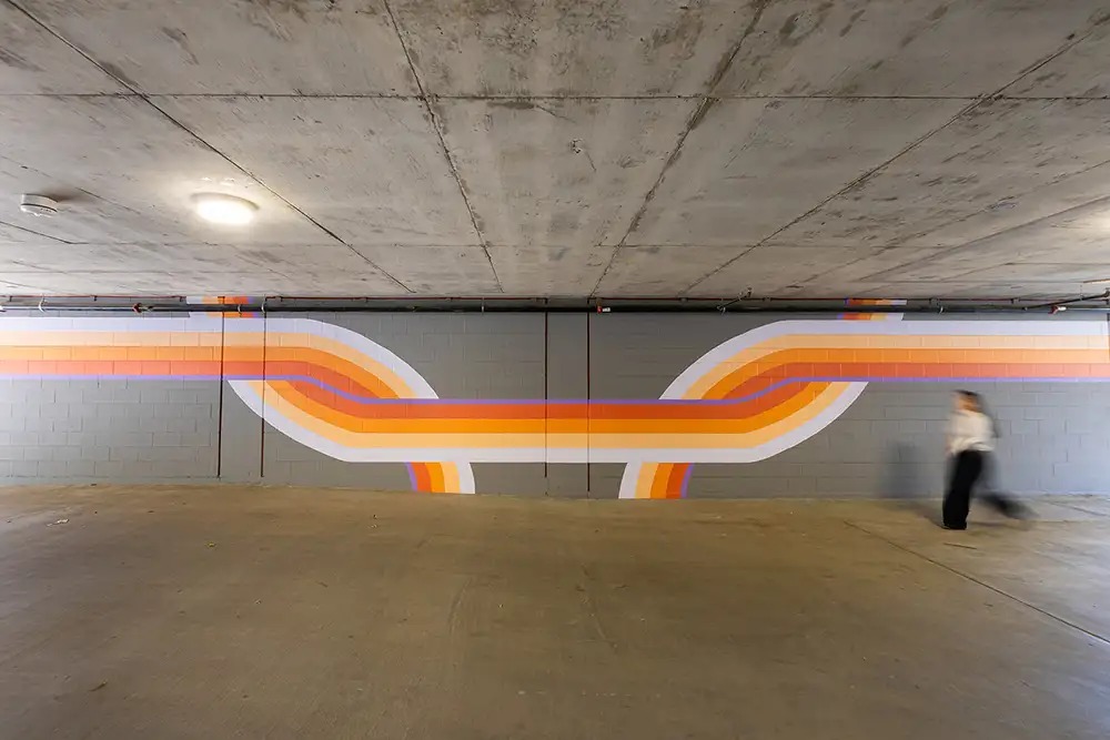
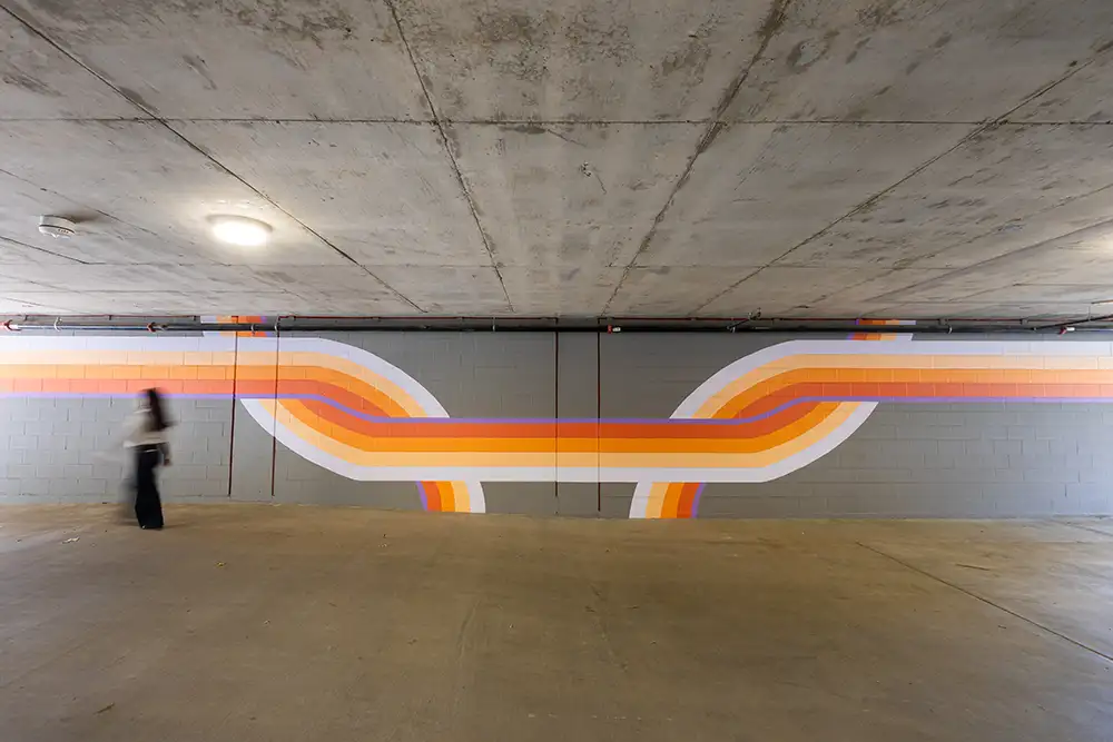
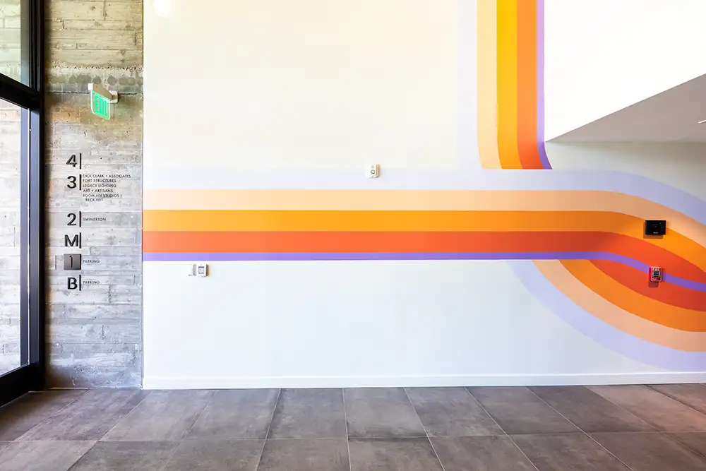
In the parking garage, a mural I like to say feels like a hug features hand-painted, crisscrossing lines that pull visitors from their car into the lobby, doing double duty as wayfinding and welcome.
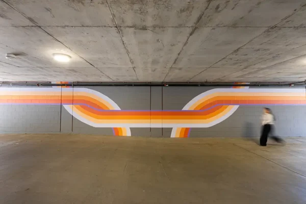
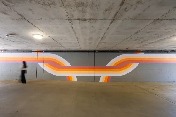
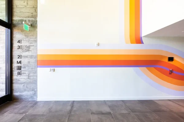
Gallery: A hand-painted mural by local artist Michael Wayne Hall starts in the parking garage and leads to the lobby, doubling as wayfinding.
If you asked me to pick a favorite, I’d probably say the aluminum piece in the lobby. The scale of it stops people the second they walk in. But I have a real soft spot for the triptych with wild bunnies tucked into the detail. It tells you this is a creative, energetic space as soon as you arrive.
The ROI with Art is Real (and Instagrammable)
Since the art was installed at WORKBENCH, the response has been overwhelming. It’s become a huge part of the identity of the building.
At the recent GlobeSt Women of Influence CRE conference in Colorado, people I didn’t know approached me to say how much they loved the art in the lobby at WORKBENCH. Someone had taken a picture, sent it to them, and it spread organically. The PR team for WORKBENCH has put the art front and center in the marketing pitch for the building. Top brokers from firms like CBRE and Stream are messaging me about it. Our co-development partners at Swinerton on the second floor, for whom we curated a 35-piece art package, told us they’re getting more attention for the art than they ever imagined.
At that same Colorado conference, I asked a panel of CRE developers if they actively calculate the ROI of art. One panelist shared that a mural they commissioned for a property in Phoenix became the third most Instagrammed spot in the entire city. That mural is working as hard as any other line item in the budget, arguably harder, and for less money. It introduces their brand, gives the space an identity, and proves they care about the people using the property.
If This Is What You’re Building Toward
I’m not trying to convince everyone that art belongs in their budget. But if you’re a developer, architect, or organization trying to create a unique identity, differentiate your brand, or make people feel like you care about their experience in your space, art is one of the easiest, most impactful ways to get there. I’d argue it’s easier, more cost-effective, and more memorable than almost anything else you’re weighing.
Working inside WORKBENCH every day, I feel that argument in a way I couldn’t before I lived it. The art has become part of the building’s identity, part of our identity, and part of the reason I’m proud to bring people through our doors.
I always believed art could do that. Now I’ve paid for it myself, and I believe it more.