
Commercial construction firm Swinerton, known as much for their innovation as they are for being a trusted brand for over 130 years, wanted an art package for their new Austin offices that captures all the above. True to form, Swinerton recently relocated their Austin team to an innovative four-story, mass-timber building called WORKBENCH. They constructed the entire building through a multi-partner development that brings local firms from across the commercial real estate sector together under one roof—including Art + Artisans. We curated a 35-piece art package for their new space, located on the second floor. It’s one that showcases the Swinerton brand in truly memorable ways while infusing Austin’s unique spirit throughout.
Art Criteria: Brand and Community
When it came to art selection criteria, a top priority for Swinerton was that their brand be represented. For this reason, 100% of the original art uses Swinerton brand colors heritage blue, future blue, and white, along with Swinerton accent colors orange, turquoise and grey. Branding elements like the Swinerton stripes are sometimes referenced, and one highly engaging piece features artwork from the Swinerton logo in an unexpected way.

Image: This iconic artwork from the Swinerton logo features prominently in one mural.
Swinerton also wanted the commercial building industry to be represented. Much of the original art takes inspiration from the tools of the trade, such as architectural drawings, hard hats and construction materials.
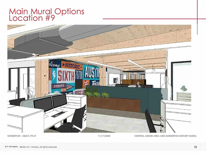
Image: Plans for an Austin mural began before construction on the new development, allowing for better integration of the mural into office architecture.
The WORKBENCH development project prioritizes community, bringing local, Austin firms from across the commercial real estate sector together under one roof. It was important to Swinerton that Austin be a recurring theme of the artwork, too. Austin is represented in their art package literally, through artistic depictions of Austin landmarks, and figuratively through pieces that capture the unique western, musical, and relaxed energy of the city. In addition, 100% of the original art was commissioned from Austin artists.
The Perfect Art for an Innovative Brand
As a 138-year old company, Swinerton puts a lot of stake in their brand. We helped them showcase their iconic logo art in a way that exemplifies their commitment to innovation while solidly leveraging their brand heritage. In one hand-painted, anamorphic mural, the Swinerton logo is suddenly revealed in 3D when viewed from the right perspective.
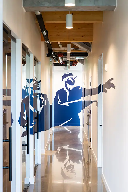
Image: An anamorphic mural featuring Swinerton logo art was hand-painted in a corridor at their new Austin offices.
The piece defines “out-of-the-box” thinking, a Swinerton core value that was baked into the logo in 2018 when they revised it to have the builder literally pointing his finger outside the box of the logo.
Image: Swinerton’s primary logo.
The builder and the architect in the logo art also represent Swinerton’s focus on teamwork and collaboration, as well as a commitment to putting people first.
Designed with projection mapping, the anamorphic mural also provides wayfinding in a large office space with many hallways.
The mural took a considerable amount of planning between the artist and Art + Artisans project manager Emily Palmer. The corridor is high traffic due to a number of amenities located there. It also contains a variety of surfaces, including drywall, glass and open doorways. This resulted in the artist hand-painting the mural with thick, durable paint used in construction for high-traffic areas.
“If you look really closely, you can see the brush marks, which adds a little extra touch to it, because it just shows that it was painted by hand, and I think that makes it really special,” Palmer says.
The mural gets a smile and a gasp from nearly everyone who sees it. People spend time examining it, wanting to understand how it was made. A remarkable amount of engagement for a brand logo.
Heritage and Future: Representing a Brand Through Color, Material and Subject
For Swinerton’s art package, all original art was commissioned to be made using brand colors. To represent their work in the commercial building industry, some of the original art was made with building materials, while other pieces depicted construction workers and gear.
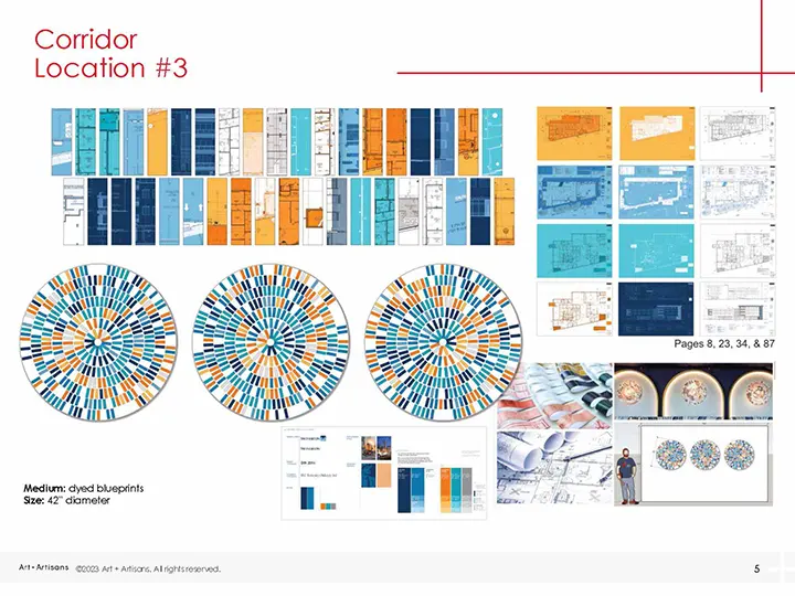
Image: Plans for art made with dyed and cut architectural drawings of the new office building.
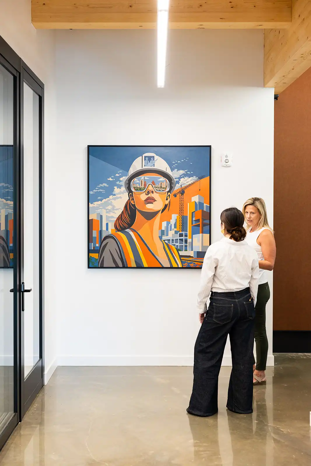
Supporting women in construction is a priority at Swinerton, so they commissioned a painting to honor the women in this male-dominated field. The resulting portrait of a woman in a hard hat with a construction site behind her and the Austin skyline reflected in her safety glasses is a favorite around the office. The painting uses Swinerton brand colors and immediately greets everyone who steps off the elevator with a symbol of forward-thinking and inclusion.
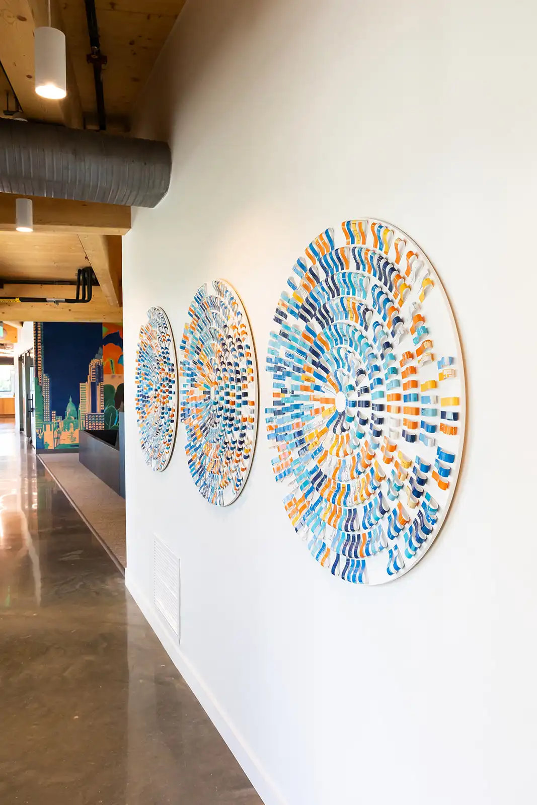
In a corridor, architectural drawings of the WORKBENCH building were dyed in Swinerton brand colors and cut to create geometric circles for a wall installation.
In the dining lounge, a building-materials composition features canvas, wood and tile. Surfaces with Swinerton brand colors are wood painted with acrylic. The artist was inspired by the general contractor who uses different materials to build a strong and useful building. Like the building, the artist chose each material for a purpose that adds to a greater whole.
Art that Represents Community and Place
Swinerton was dedicated to commissioning only Austin artists, wanting the art to embody the “Austin vibe” which they define as musical, western, and relaxed.
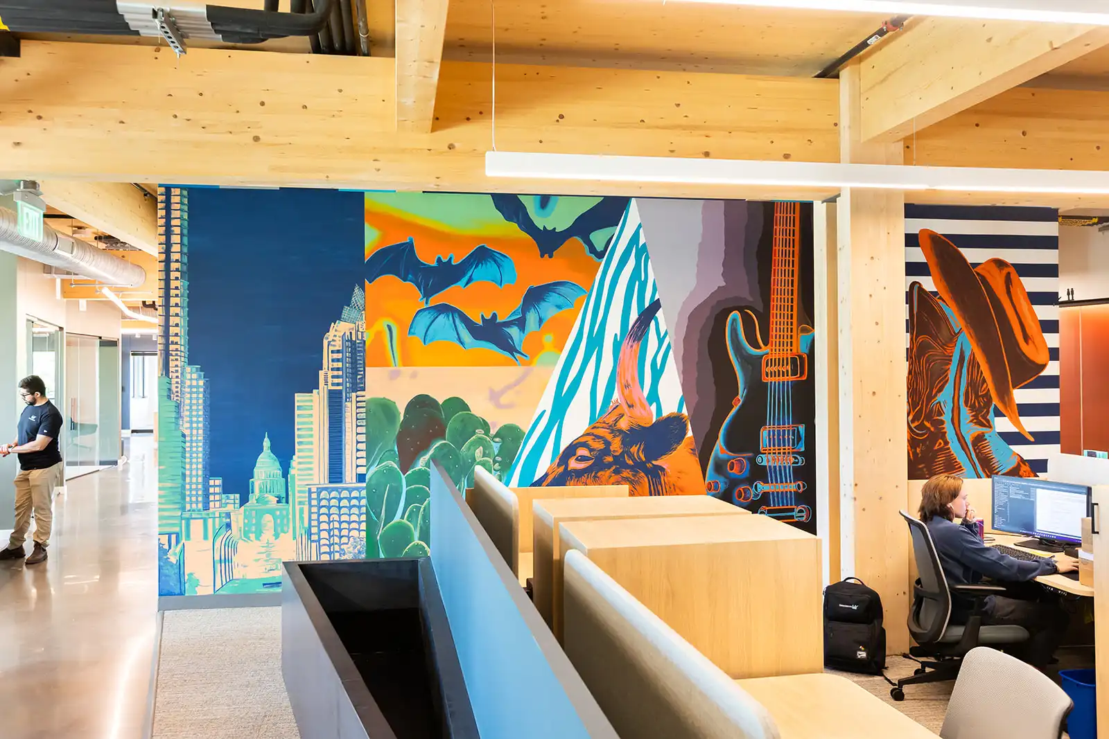
A large-scale Austin-themed mural was erected in the center of Swinerton’s offices. It features community icons like the Austin skyline, bats, a longhorn, a guitar, a cowboy hat and boots. The mural is painted in Swinerton brand colors and features a nod to the Swinerton stripes, a branding element that represents their desire to earn their stripes. A rodeo painting based on a favorite mural in Austin’s Moody Center provides a western vibe and, displayed throughout Swinerton’s offices, are high-quality prints of mixed-media pieces depicting Austin landmarks.
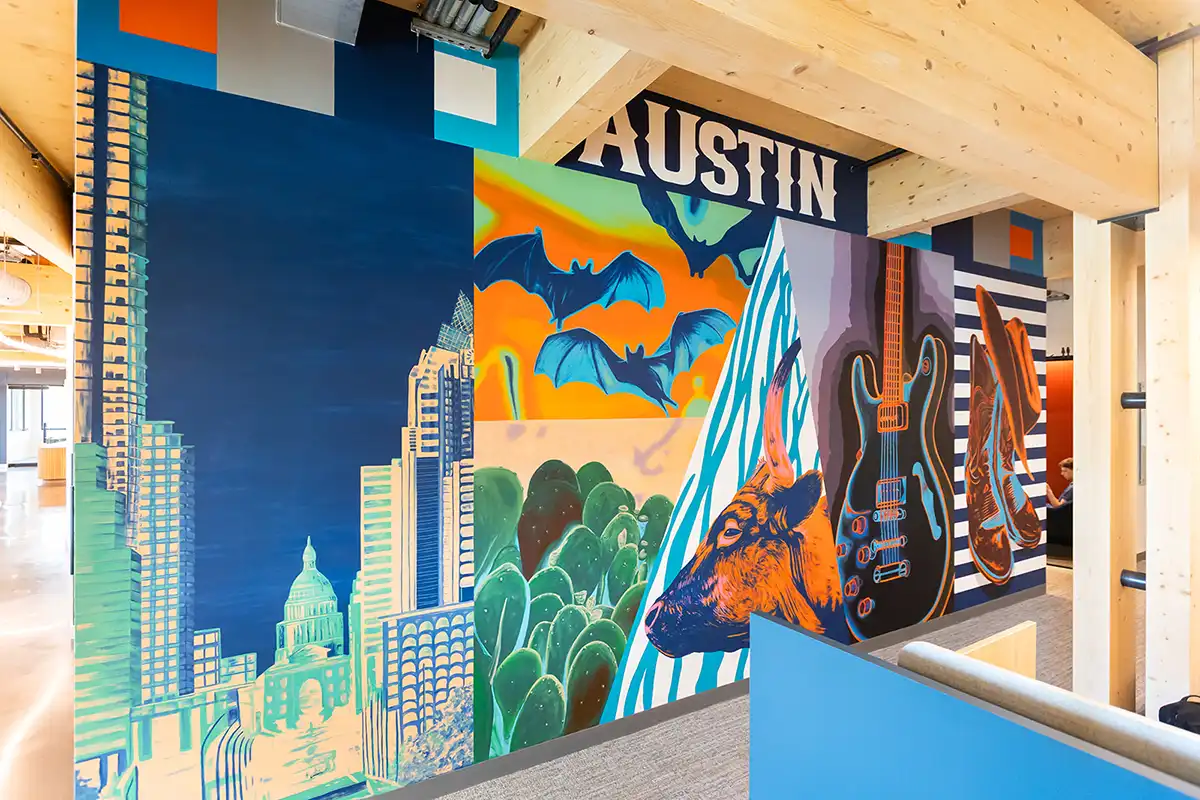
A centrally located office mural depicts multiple Austin icons as well as a nod to the Swinerton stripes.
Conclusion
The Swinerton project exemplifies how a strategic, intentional art package can authentically communicate an organization’s brand, ethos and ties to the community. The art package sets the tone for this new chapter in Swinerton’s history. One that is innovative, forward-thinking but grounded in legacy.
