WELL-Certified workplaces have major benefits. The latest study links WELL Certification with improved worker productivity, health and creativity. What you might not know is that art can be used towards points for WELL Certification. In this article we’ll go over 5 ways to use art as a wellness feature in your building. Plus we’ll show you some examples from our past projects. Developers, architects, interior designers, building operators, and tenants, read on to learn more about this valuable strategy.
The WELL Building Standard was launched in October of 2014 and is the first building standard to focus solely on the health and wellness of occupants. Creators saw the need to elevate human health and comfort to the forefront of building practices. They spent seven years reviewing existing research on the effect of spaces on individuals and evidence-based health and wellness interventions. Through the process, they identified over 100 performance metrics, design strategies, and policies that can be implemented to improve the health and wellness of people through the built environment. A global community of expert advisors continue to shape the evolution of the WELL Building Standard to keep up with the latest findings in health and well-being.
Opportunities to Use Art in the Service of Health
The WELL Building Standard is organized into ten categories of wellness called concepts. Three of them, Movement, Mind and Community, contain opportunities to use art in the service of distinct health intents.
Movement: The WELL Movement concept promotes physical activity in everyday life through environmental design, policies and programs to ensure that movement opportunities are integrated into the fabric of our culture, buildings and communities.
Mind: The WELL Mind concept promotes mental health through policy, program and design strategies that seek to address the diverse factors that influence cognitive and emotional well- being.
Community: The WELL Community concept aims to support access to essential healthcare, build a culture of health that accommodates diverse population needs and establish an inclusive, engaged occupant community.
The following are 5 ways art can be used as a wellness feature, as described in the WELL Building Standard. Each is accompanied by photo examples from our past projects.
The goal of this Movement feature is to leverage aesthetic design, through art and other strategies, to encourage stair use. The WELL Building Standard requires at least one aesthetically designed staircase that services all occupiable floors and is open to regular occupants of a building.
Displaying art on each floor of a staircase while incorporating one of the other strategies listed below can achieve the aesthetically pleasing component of this feature.
- Music
- Daylighting using windows or skylights of at least 1 m² [10.8 ft²] in size
- View windows to the outdoors or building interior
- Light levels of at least 215 lux [20 fc] when in use
- Biophilic elements
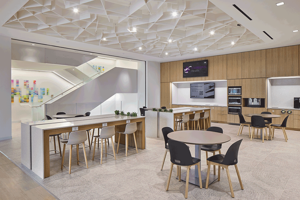
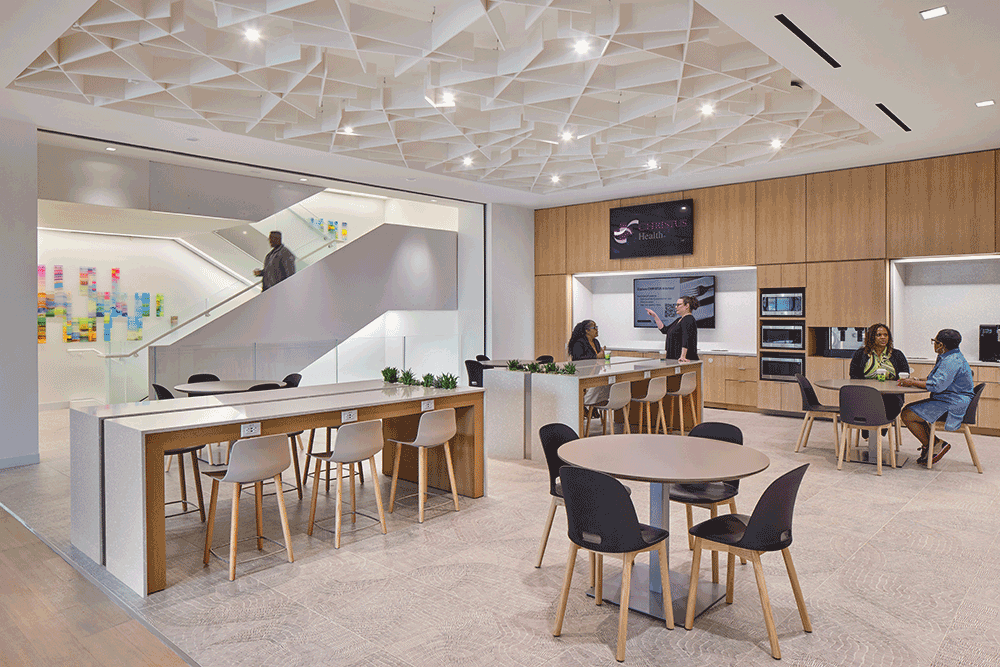
We helped our clients at CHRISTUS Health find and install artwork in their stairwells to encourage their use.
2. Using Art at Point-of-Decision Areas
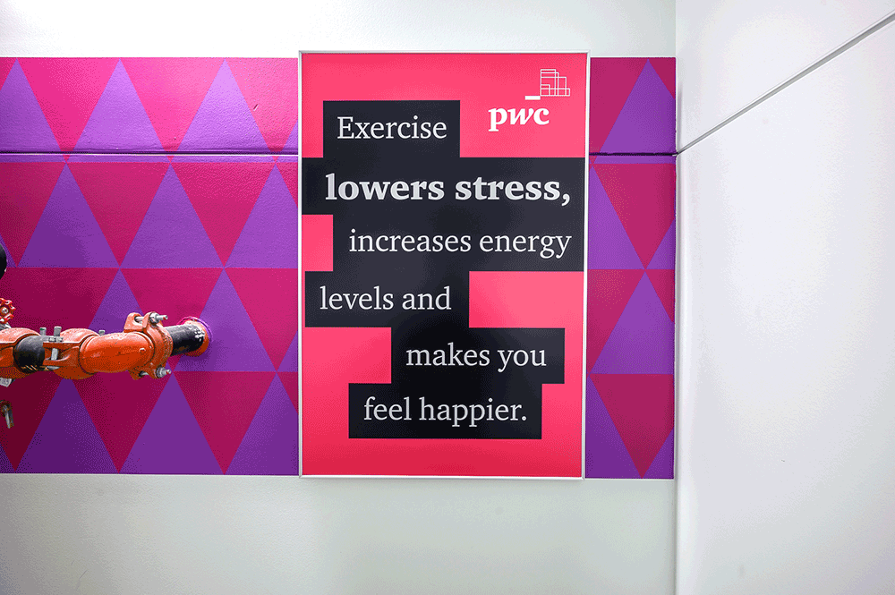
This Movement feature calls for motivational, point-of-decision signage to inspire occupants to choose the stairs over elevators and escalators. Which is something that can be achieved with custom art graphics.
According to the WELL Building Standard, motivational, point-of-decision signage should be present at the following locations.
1. Near the main building entrance or the reception desk.
2. At elevator or escalator banks on each floor.
3. At the base of stairs and stairwell re-entry points on each floor.
We helped our clients at a Dallas financial services firm find and install bright, motivational messaging in their stairwells that informs employees of the benefits of taking a break from work and taking the stairs.
3. Using Art to Encourage Pedestrian Activity Outside
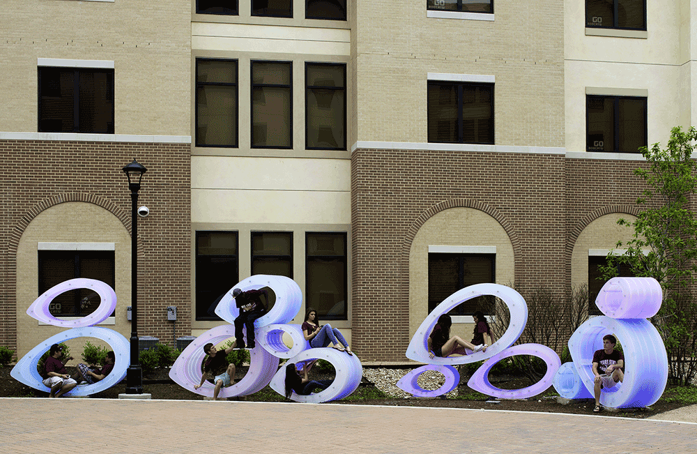
Because site-level factors, including aesthetics, play an integral role in the choice to become more physically active, one of the goals of this Movement feature is to demonstrate that the area around a building fosters walkability, or is pedestrian friendly. The WELL Building Standard says this can be partially achieved by incorporating murals or other artistic installations on the first floor or first 18 vertical feet of external building walls.
Art + Artisans’ coordinated this award-winning outdoor art installation for our clients at Texas State University. The series of twelve, organic, illuminated sculptures called Fish Bellies were installed in the courtyard of a new freshman residential housing development. The sculptures are translucent during the day and turn into a bioluminescent landscape with bright neon colors at night. Multiple hidden buttons allow students to change the sculptures’ colors and cadence. The result is an immersive, interactive experience that draws in folks from all over campus.
4. Using Art to Provide a Connection to Nature & Place
 This goal of this Mind feature is to support occupant well-being by incorporating the natural environment in direct, indirect, and symbolic ways throughout the project. Additionally, integrating design strategies that celebrate the project’s unique identity, based on a sense of place, can further enrich the space for occupants and visitors.
Part 1: Provide Connection to Nature
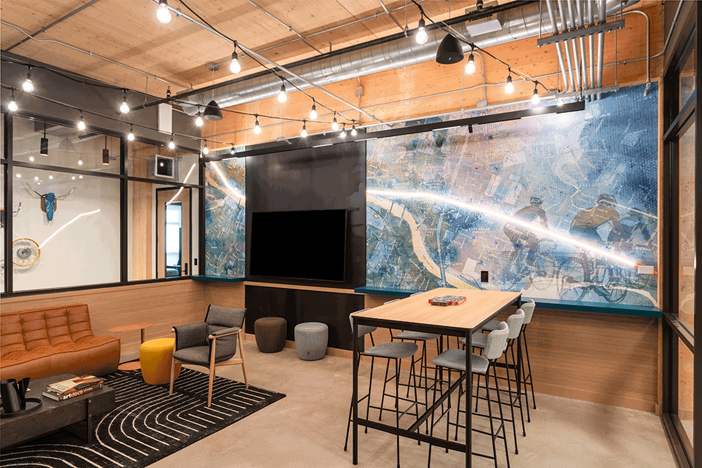
For this part of the feature, projects must integrate both direct and indirect connections to nature. A direct connection to nature can consist of incorporating plants, water or nature views. Indirect connections to nature, on the other hand, are purposely non-prescriptive in the WELL Building Standard so that project teams can explore a variety of options in their space. Artwork that depicts natural scenes or employs natural materials can fulfill this indirect connection to nature requirement.
We helped our clients at Austin Energy commission this hand-painted mural as part of an art package for their new 200,000-square-foot headquarters. The art is inspired by themes of local Austin culture including a love of nature. The mural features an inspirational message surrounded by wildflowers native to the Austin area.

Part 2: Provide Connection to Place
The WELL Building Standard says that incorporating aesthetic elements like local culture, materials and art can help celebrate a project’s unique identity and further enrich the space for occupants and visitors.
Parameters for this part of the feature are also non-prescriptive and project teams are encouraged to derive their own interpretation of “connection to place.” Some examples from the WELL Certified website include incorporation of public art from local artists, art that highlights local culture, images or design elements that feature the local area, and images or decals that represent the company’s history and motto.
Whatever teams decide, the project should integrate design elements that address:
1. Celebration of culture (e.g., culture of occupants, workplace, surrounding community).
2. Celebration of place (e.g., local architecture, materials, flora, artists).
3. Integration of art.
4. Human delight.
We helped our clients Greystar and Ivanhoé Cambridge find an art package for their class-A office tower in downtown Austin that incorporates the natural beauty of Waller Creek Greenbelt trail outside and draws inspiration from the neighborhood’s rich musical history.
Original mosaics comprised of handmade, custom tiles are filled with “Easter eggs” about Waller Creek, the Red River Music District, and other local history. Graphic murals nod to local fauna with colors and textures that perfectly marry the surrounding natural environment of cream-colored local Austin limestone.
5. Using Art to Help with Wayfinding
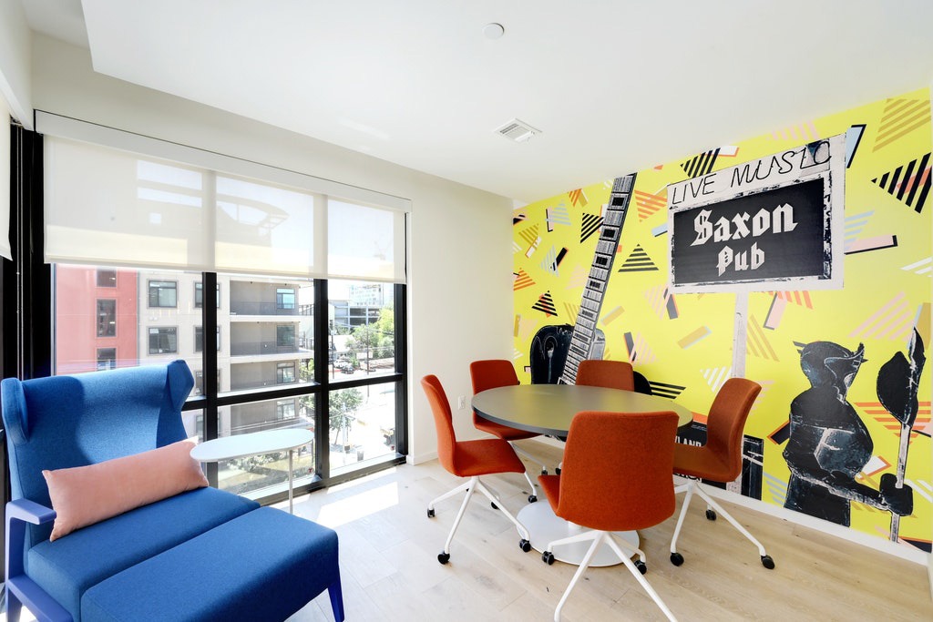 The intent of this Community feature is to employ design that can be understood, accessed, and used to the greatest extent possible by all people regardless of their age or ability. Wayfinding strategies that help individuals intuitively navigate through a project are one part of the requirement.
Teams can use, for example, signage, tactile maps, symbols, auditory cues, information systems, images, various languages and color that considers color blindness.
Art and vinyl wall coverings can be used to establish wayfinding, aid in orientation, and provide spatial familiarity. For example, employing artwork that is distinct in shape and color can provide helpful landmarks that, in many cases, eliminate the need for signage.
We helped our clients at HillTop student housing in Austin employ artwork to differentiate study areas on each floor. Vinyl wall coverings of different legendary Austin music venues adhere to the building’s Austin-culture theme. The higher the floor, the more prestigious the music venue featured on the wall.
WELL certification elevates your property and shows you care about the health and wellness of those who use your building. Many people don’t know that art can be utilized towards earning points for WELL certification. Our art consultants have a wealth of specialized knowledge and our on-staff WELL Accredited Professional can guide you through the process. Contact us to learn how we can put our skills to work for your next commercial project.
- Why is WELL Certification important? [International WELL Building Institute]
- WELL Building Standard V2 [WELL Certified]
- New Research Showcases Major Benefits of WELL Certification [WELL Certified]

